It aims at crafting sites to provide an optimal viewing experience, easy reading and navigation with a minimum of resizing, panning and scrolling—across a wide range of devices (from desktop computer monitors to mobile phones) and benefit rich content heavy sites as well.
Importance of Responsive Web Design
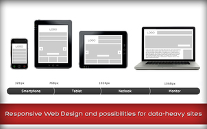
Responsive web design is a hot topic with the ever increasing popularity and widespread use of mobile devices like the iPhone and iPad. It’s difficult to ignore the fact that websites are being viewed across various screen sizes and it looks like the days of designing a site for one minimum resolution are almost gone. It helps the layout to get changed according to the user’s computer screen resolution. More precisely, the concept allows for an advanced 4 column layout 1292 pixels wide, on a 1025 pixel wide screen, that auto-simplifies into 2 columns. Also, it suitably fixes on the Smartphone and computer tablet screen. By now, with the amazing growth of mobile usage, every single website should be responsive to be able to attend to every user’s screen size needs.
Responsive designing plays a vital role in the usability point of view, helping the images layout serve at different resolutions, ranging from larger screens to smaller ones. The scaled images appear to change fluidly with the help of updated developer tools and coding languages, allowing designs to look sharp in every context. It is remarkably different from traditional designing in terms of technical and creative issues and a careful use of this can do wonders while designing. Though the shift to mobile is happening at an extraordinary speed, Today, 30% of Mashable's traffic is mobile. By the end of next year, this may exceed 50%.
Necessity of Responsive Web Design
It’s becoming a necessity for websites today to get regular feature updates and add-ons, especially for rich data sites with heavy content like the e-commerce and Web apps. There’s so much data available on how people use your website that it’s an oversight not to adjust your user experience based on that data. At some point, maintaining and improving multiple versions of the same website means that time and money either go toward adding fewer features to both versions, or more features to only one (probably the desktop version). Many companies are still slow to invest the time and money into the development required to turn their antiquated websites into responsive websites, that renders perfectly no matter what device a person is using.
As the internet transforms further into a platform of services and user interfaces that tie those services together, leveraging this technology in the future will allow companies to integrate a plethora of back-end services, such as Facebook, Twitter, Salesforce.com, Amazon Web Services. Responsive design makes the application look great on all devices without custom coding for each device and varied screen size.
If you want to get ahead in the race with your competitors and don’t want to fall behind and watch your competitors launch responsive websites while yours is still stuck in an archaic age, this is the right time to get responsive with your web application development.
We provide software development services. If you would like to know more about our expert web developers, please get in touch with us at Mindfire Solutions.
Importance of Responsive Web Design
Responsive web design is a hot topic with the ever increasing popularity and widespread use of mobile devices like the iPhone and iPad. It’s difficult to ignore the fact that websites are being viewed across various screen sizes and it looks like the days of designing a site for one minimum resolution are almost gone. It helps the layout to get changed according to the user’s computer screen resolution. More precisely, the concept allows for an advanced 4 column layout 1292 pixels wide, on a 1025 pixel wide screen, that auto-simplifies into 2 columns. Also, it suitably fixes on the Smartphone and computer tablet screen. By now, with the amazing growth of mobile usage, every single website should be responsive to be able to attend to every user’s screen size needs.
Responsive designing plays a vital role in the usability point of view, helping the images layout serve at different resolutions, ranging from larger screens to smaller ones. The scaled images appear to change fluidly with the help of updated developer tools and coding languages, allowing designs to look sharp in every context. It is remarkably different from traditional designing in terms of technical and creative issues and a careful use of this can do wonders while designing. Though the shift to mobile is happening at an extraordinary speed, Today, 30% of Mashable's traffic is mobile. By the end of next year, this may exceed 50%.
Necessity of Responsive Web Design
It’s becoming a necessity for websites today to get regular feature updates and add-ons, especially for rich data sites with heavy content like the e-commerce and Web apps. There’s so much data available on how people use your website that it’s an oversight not to adjust your user experience based on that data. At some point, maintaining and improving multiple versions of the same website means that time and money either go toward adding fewer features to both versions, or more features to only one (probably the desktop version). Many companies are still slow to invest the time and money into the development required to turn their antiquated websites into responsive websites, that renders perfectly no matter what device a person is using.
As the internet transforms further into a platform of services and user interfaces that tie those services together, leveraging this technology in the future will allow companies to integrate a plethora of back-end services, such as Facebook, Twitter, Salesforce.com, Amazon Web Services. Responsive design makes the application look great on all devices without custom coding for each device and varied screen size.
If you want to get ahead in the race with your competitors and don’t want to fall behind and watch your competitors launch responsive websites while yours is still stuck in an archaic age, this is the right time to get responsive with your web application development.
We provide software development services. If you would like to know more about our expert web developers, please get in touch with us at Mindfire Solutions.
 RSS Feed